Since coffee tables have prominent positioning in your living spaces, and many instances are the focal point to the living room, they should function and merge effortlessly into your space. As a beautifully-curated celebration of what drives your personality, style, and what makes your house feel more like home, we explore five ways to spruce up your coffee table and create a 'conversation starter.'
Considered through this lens, we explore colour, style, shape, and themes that genuinely connect with your personality and interior style. Everyone is different, and each interior is unique; therefore, styling a coffee table should not be overlooked. You have found the perfect table, now have fun and use this canvas to add character to your living space!

Unknown Source
Consider Size & Proportion
—
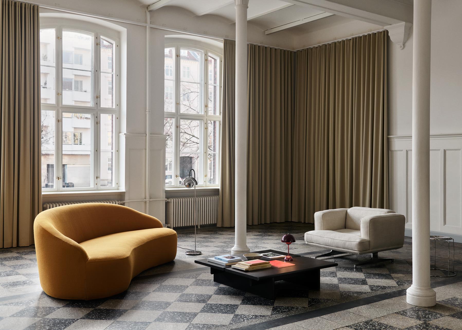
A great starting point to styling your coffee table is identifying the size and the number of tables to style. Once this is known, you will naturally distinguish how many objects to use for styling as you won't want to over-style or compress too many decor pieces onto one tablescape. It can be quite overwhelming and not allow much room for functionality etc. Also, consider the height of your proposed decor pieces, and whether they will complement the interior or conflict with other furniture objects.

Image via The Nordroom
Paul Henningsen's Copenhagen Apartment by Norm Architects
Consider Your Interior
—
When it comes to selecting objects and colours, consider your interior. What do you see around you? Is it a neutral interior? Are your furniture pieces heavy and bold? If your interior is minimal and simple, add some depth to your coffee table with objects that throw warmth. For instance, layer a stack of books that best reflect your interests, fresh flowers for a pop of colour for contrast, and your favourite candle and cloche. However, if your furniture pieces are heavy and bold and a lot is happening in your interior already, opt for a clean, minimal, and simplistic styling option. Perhaps a couple of books and your favourite flowers that compliment your interior colour scheme. Flowers or greenery always add a soft element to any interior.
 Source Unknown
The 'Good Ole' Book Stack
—
We are all dupes for statement designer books, especially when displayed upon our coffee tables. If you have a larger table surface, you can get away with piling multiple books into categorised stacks of similar sizes, colours, and genres. Try two, three, or even four stacks and layer smaller decorative objects, such as sculptures, candles, vases, etc. The 'good ole' book stack is an excellent styling option since books create a well-balanced foundation for other smaller objects to merge seamlessly.
Interior by Lotta Agaton Interiors | Styling by Marie Ramse and Pella Hedeby | Photography by Kristofer Johnsson
The Rule of Three
—
When it comes to interior styling, there is a special rule that most follow. The 'rule of three' is visually appealing to most eyes and creates a point of interest of beautifully curated categories that genuinely express who you are. However, when we mention the 'rule of three,' we don't necessarily mean to restrict yourself to three decorative objects, we recommend arranging your most desired decor pieces into three segments. Envision your coffee table, a stack of books styled with your favourite decorative piece, a tray or bowl with a collection of other decorative pieces, and a contrasting vase with flowers or sculptural object. Or perhaps a coffee table with two styling segments and an additional side table with a complimenting decorative object.
Styling & Image by Banda Property
Styling & Image by Interior Marketing Group
Symmetrical or Asymmetrical?
—
Now you have all these decorative objects, themes, colours, books but not sure how to incorporate it into your tablescape. Do you prefer a traditional symmetrical layout or like to challenge the interior and opt for an off-centre alternative? There is no rule to determine which way is the correct way. However, your table size is often a good indicator of how you can position your most loved possessions. For a larger table, you can get away with both options, yet a smaller table surface may look better as a traditional composition, symmetrical.
Styling & Image by Banda Property


